Sunglass & Watch Shop

The Sunglass and Watch Shop, Bermuda’s top destination for stylish eyewear, needed a modern, brand-focused brochure site to boost sales and showcase their wide range of designer products.
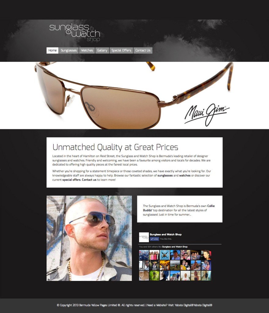
Yabsta Digital’s creative/UX team designed a fashion-forward interface with strong product visuals. A muted background of black, grey and white gives the site a sleek, uniform feel, allowing the colours and styles of the shop’s designer brands to truly stand out.
A jumbotron slider situated prominently on the homepage displays the Sunglass and Watch Shop’s most popular shades. A large social callout references the store’s growing fan base while a sans-serif font stack, comprising several distinct typefaces, lends a vibrant, urban feel. Close-up photography encourages the user to view the products in store.
A horizontal, top-level navbar allows users to explore the site easily. Larger set headlines, and minimal written content, focus the attention on what’s important: the Sunglass and Watch Shop’s merchandise. Similarly, a three-column layout on the product pages ensures that each brand is given ample, and equal, space to shine. Images, displayed on a white background, “pop” out at the user via a ratio aspect effect when hovered over with the cursor. Eye-catching and fun, this highlights each brand’s individual style.
Mobile optimized and fully responsive, we crafted a contemporary, visually appealing website that can be viewed on any device, from desktop computer to tablet and smartphone. Easy to access on the go, it’s fun, functional and caters directly to the company’s shade-obsessed clientele.


