Eva’s Nail Care

Eva's Nail Care, one Grand Cayman's most popular salons, needed a dedicated web presence and logo to promote their staff, services and specials.
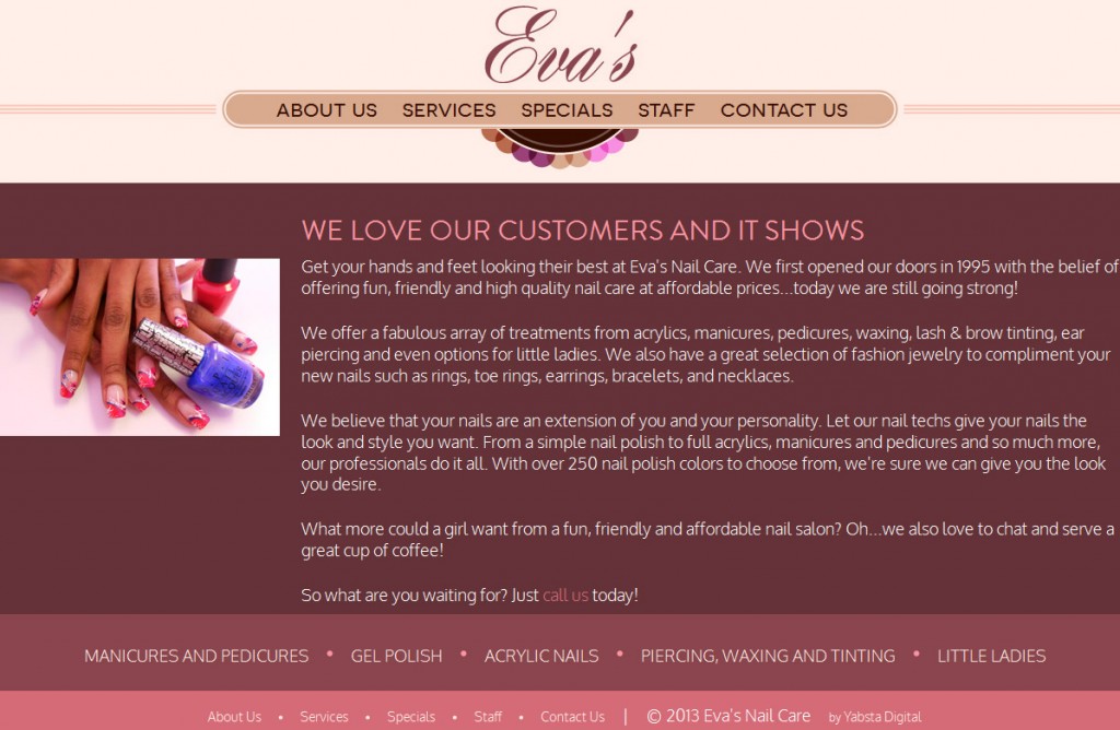
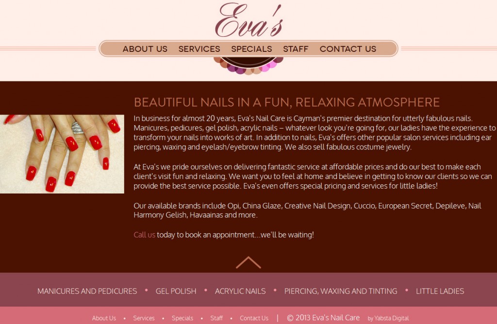
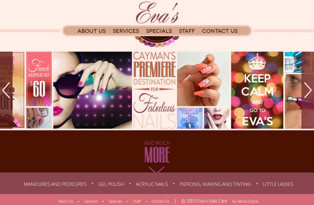
They wanted their first ever website to expand their online presence, solidify their branding and complement their Facebook page: The result is all about fun! Starting from scratch, Yabsta Digital created a concept that reflects the salon’s relaxing, friendly atmosphere. We created a warm orange, brown and peach colour palette, using these shades to design a trendy circular seal logo with a retro-modern feel.
A collage of vibrant imagery placed horizontally across the top of the page functions as a call-out promoting Eva’s specials and linking to their services and social media. Reminiscent of a Pinterest gallery, it showcases the salon’s lively personality in a colourful, eye-catching way. For continuity purposes, we sourced several images directly from the Eva’s Nail Care Facebook page. 
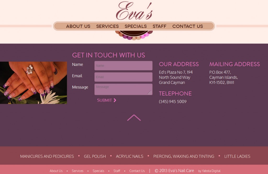
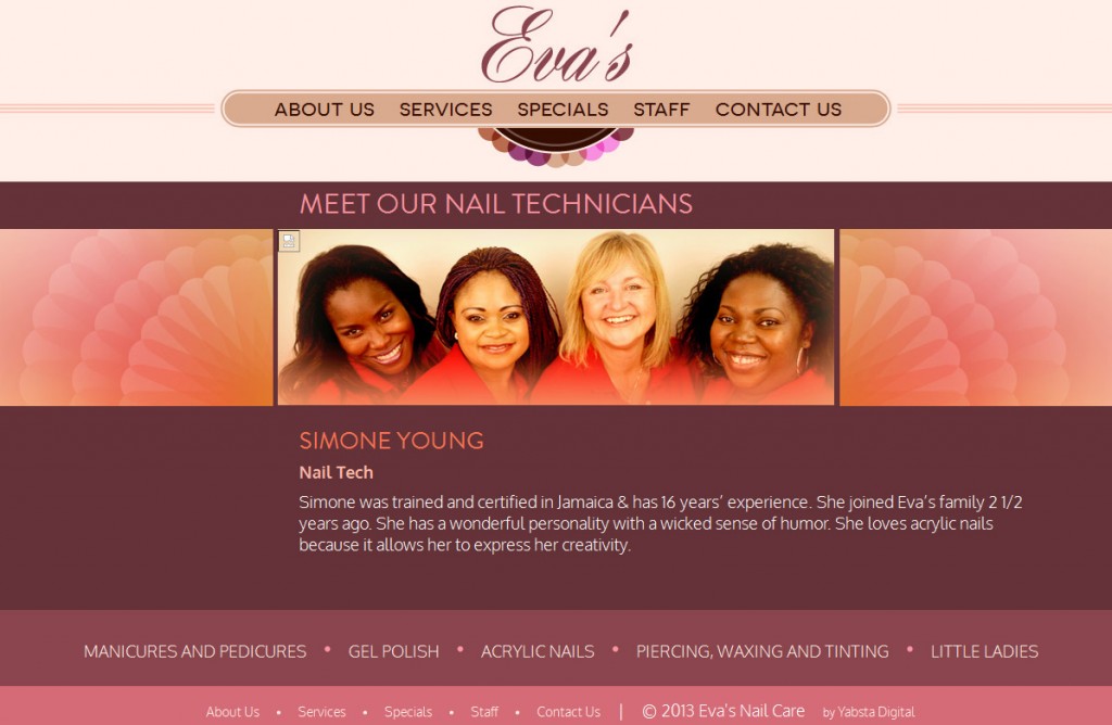
A one-page user experience is on-trend and an exercise in simplicity. As users scroll down, the home page expands vertically to reveal the Web content. Navigation accessibility is achieved via centrally located arrow buttons, as well as top and bottom navbars, the latter of which extolls Eva’s wide range of services.
Mobile-optimized and fully responsive, Yabsta Digital’s development team created a website that adapts to any desktop, smartphone or tablet device. The site build, however, was not without its challenges. Initially built in json, javascript, html and CSS to ensure laser-quick loading, the site ultimately had to be imported into WordPress. Thinking quick, our developers implemented a plug-in that serves json, retaining the original build and loading speed.The navigation buttons and custom contact form requested by Eva’s Nail Care were rendered via Angular.js and PHP. The result is a bespoke design that is as functional as it is fabulous.


