Posted on: August 12, 2013
Posted by: Mark Araujo
Categories:
Development
Creating an online banner ad is much like creating a highway billboard, because it must grab the attention of web users on the move. Just like drivers on the highway, most Internet surfers are focused on where they’re going instead of on the ads that they pass along the way. This post will discuss designing the best banner ads, which are ones that will stand out to users and promote your small business.

Consumer Research
When designing a form of advertising meant to capture the attention of viewers, the images and wording must be powerful enough to provoke the feeling of need for the product or service being promoted. Creating such a desire through an advertisement requires knowledge of both the consumer and how they relate to the product or service itself. Before creating this type of ad, the designer must find out as much demographical information as possible about the business’s target consumers for advertisements. Knowing as much as possible about the target audience is great help when brainstorming the types of images and words that will push these individuals to want to know more – you want to motivate them to click. Being aware of such audience demographics as the age range, income brackets and location of the consumers, as well as whether the product or service in question appeals more to a certain gender, gives you a head start when it comes to creating a banner that is engaging and eye-catching.
Images
Banner ad design isn’t complete without images, and best practices dictate the use of ones that are relevant to the product or service and that will capture the maximum amount of attention from the targeted consumers. A banner ad for a luxury car company that features a teenager driving a Mercedes is an example of a poorly chosen image, as most teenagers cannot afford luxury cars and, further, most parents do not feel inclined to purchase them as gifts. However, an image of a middle-aged man, woman or family driving a luxury car would target and appeal to the business’s ideal consumer.
Copy
When it comes to online banner ads, the next step is crafting a strong heading and creative copy to complement the visual and extoll the product or service. The wording, like the image, must relate to the target market. For example, while a slang word like “swag” may suit an ad for an urban clothing store for teens, the same word would cause confusion or devaluation when used for a high fashion boutique. The rule of thumb is less is more; you must deliver your message quickly and succinctly. To return to the highway billboard metaphor, the more words a driver comes across en route to an intended destination, the less likely they are to actually read it. The best banner ads forego explaining the whole product or service in favour of short, punchy slogans and phrases that interest viewers enough to click the ad, which ideally links to a page that provides more detail.
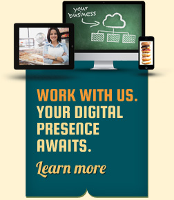
Employing banner ad design services is a great way to boost your small business and gain web traffic, leads and customers. The above best practices are key to creating advertisements that use relevant, engaging images, headlines and copy to target your ideal consumers. It’s easy to see how creativity and imagination, alongside some design basics, go a long way when promoting your company’s products and services. The banner ads seen here are just two examples of Yabsta Digital’s design services. Contact us today to discuss using advertisements to expand your reach.
Creating an online banner ad is much like creating a highway billboard, because it must grab the attention of web users on the move. Just like drivers on the highway, most Internet surfers are focused on where they’re going instead of on the ads that they pass along the way. This post will discuss designing the best banner ads, which are ones that will stand out to users and promote your small business.

Consumer Research
When designing a form of advertising meant to capture the attention of viewers, the images and wording must be powerful enough to provoke the feeling of need for the product or service being promoted. Creating such a desire through an advertisement requires knowledge of both the consumer and how they relate to the product or service itself. Before creating this type of ad, the designer must find out as much demographical information as possible about the business’s target consumers for advertisements. Knowing as much as possible about the target audience is great help when brainstorming the types of images and words that will push these individuals to want to know more – you want to motivate them to click. Being aware of such audience demographics as the age range, income brackets and location of the consumers, as well as whether the product or service in question appeals more to a certain gender, gives you a head start when it comes to creating a banner that is engaging and eye-catching.
Images
Banner ad design isn’t complete without images, and best practices dictate the use of ones that are relevant to the product or service and that will capture the maximum amount of attention from the targeted consumers. A banner ad for a luxury car company that features a teenager driving a Mercedes is an example of a poorly chosen image, as most teenagers cannot afford luxury cars and, further, most parents do not feel inclined to purchase them as gifts. However, an image of a middle-aged man, woman or family driving a luxury car would target and appeal to the business’s ideal consumer.
Copy
When it comes to online banner ads, the next step is crafting a strong heading and creative copy to complement the visual and extoll the product or service. The wording, like the image, must relate to the target market. For example, while a slang word like “swag” may suit an ad for an urban clothing store for teens, the same word would cause confusion or devaluation when used for a high fashion boutique. The rule of thumb is less is more; you must deliver your message quickly and succinctly. To return to the highway billboard metaphor, the more words a driver comes across en route to an intended destination, the less likely they are to actually read it. The best banner ads forego explaining the whole product or service in favour of short, punchy slogans and phrases that interest viewers enough to click the ad, which ideally links to a page that provides more detail.
Employing banner ad design services is a great way to boost your small business and gain web traffic, leads and customers. The above best practices are key to creating advertisements that use relevant, engaging images, headlines and copy to target your ideal consumers. It’s easy to see how creativity and imagination, alongside some design basics, go a long way when promoting your company’s products and services. The banner ads seen here are just two examples of Yabsta Digital’s design services. Contact us today to discuss using advertisements to expand your reach.


