Continually advancing, web design has changed in ways we never could have imagined in recent years. This consistent development is part of what makes digital techniques and trends so fascinating to designers, business owners and Internet-aficionados alike; there’s always something new to discover and learn. In Part 1 of this blog series, I discussed responsive design, trends in scrolling, backgrounds and typography, fixed headers and minimalism. Here are six more trends and techniques that we’ve seen throughout 2013.
White/Negative Space
An offshoot of the minimalism trend, web designers have been utilizing white, or negative, space more and more in 2013. Based on the principle that the entire canvas (or web page, in this case) does not need to be filled with images or text, this technique lends itself very well to a clean, easy-to-navigate design and layout.
Retina Display Support
In 2012 Apple introduced its wildly successful Retina Display. These liquid crystal displays have a much higher-than-average pixel density and thus provide a better viewing experience on products such as iPhones, iPads and MacBooks. In order to accommodate this shift, web designers have begun using higher-resolution imagery and CSS responsive design, which allow sites to display accurately on devices with Retina Displays.
Single Page Sites
An evolution in navigation, much like infinite and parallax scrolling, single page websites are becoming more and more popular. Just as the name suggests, these sites consist entirely of one page. This trend enables designers to reach beyond the “above the fold” principle, which dictates that the bulk of content and text on a webpage should be visible without scrolling down. On single page sites, visitors simply click on a topic of interest in the header, such as “About Us,” and they’re taken directly to that section of the page. Like chocolate? Kit Kat created a great example.
Circular Elements
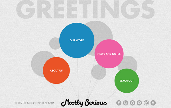
While many recent websites feature the square grid layout popularized by Microsoft’s Metro theme, circular design elements are cropping up more and more frequently. A softer, more organic take on squares and rectangles, circles fit well into many design grids and also as icons. The lack of right angles is certainly a nice change of pace.
CSS3
If you’ve never heard of it, CSS3 is the latest version of Cascading Style Sheets, a scripting language that communicates webpage appearance and formatting to browsers. Commonly used in HTML, more and more browsers are supporting CSS3, which offers a broader variety of effects. These effects include transparency, shadows and animations that are a far cry from the Flash of the 1990s.
App-Style Interfaces
Everyone has a favourite mobile app these days, and it’s only logical that app-style interface design is making its way into our websites. Many designers today are creating desktop sites that mimic the style of mobile applications – simple in content and layout, these designs offer intuitive navigation and a recognizable appearance when being viewed on mobile phones.
The techniques and trends prominent today demonstrate how far web design has come in the 21st century, and one can only imagine the places we’ll go in coming years. White/negative space, retina support, single page sites, circular elements, CSS3 and app-style interfaces are six more innovative, engaging concepts that have been popping up on our screens in recent months. Part 3 of this blog series will list the remaining best of 2013’s trends and techniques.
Image Credits: Cygnis Media & Doublemesh


