There’s no denying that 2013 has been a pretty big year for web design. Many new concepts have emerged and been championed for their innovation and creativity. As the new year inches closer (how is it already October?), it seems appropriate to take a look at the trends we’ve seen over the past 10 months. Whether you’re a professional designer or a business owner, staying up-to-date is a fascinating and inspiring part of the job.
Responsive

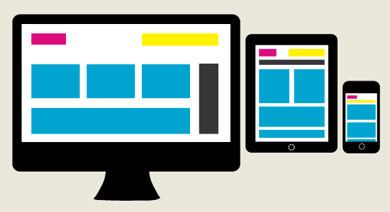
Responsive web design first came on the scene in 2012 and shows no signs of disappearing. It emerged as a result of the growing number of people using smart phones, tablets and other devices outside of traditional desktop and laptop computers to access the internet. Responsive design allows a single website to respond to and display properly across a variety of screen sizes.
Infinite and Parallax Scrolling
Yesterday’s basic scrolling has been replaced by more dynamic options in 2013. Infinite scrolling, initially popularized by Pinterest, involves the website automatically loading more content when the user reaches the bottom of the page. This improves the user’s experience significantly, as there is no need to reload the page. Parallax scrolling involves separate, parallel website elements scrolling at different speeds. This adds depth to websites, increasing interactivity and user engagement.
Fixed Headers
Fixed headers are just that – they stay put while users scroll down the page. Having a fixed header that displays your main menu allows visitors to navigate websites quickly and easily, without having to scroll back to the top to check out a different area. Done right, this technique is clever, visually appealing and functional.
Minimalism

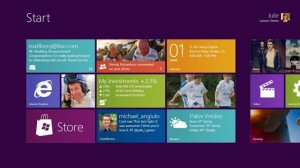
Clutter is distracting, and can even cause users to leave your site. This year we’ve seen a distinct focus on minimalism in web design – foregoing flashy images and unnecessary content in favour of what’s really important. A great example of this is Metro, the Microsoft-developed theme for Windows 8. Many of today’s designers are putting their own spin on this concept, which spotlights important content and features a grid layout.
Photo/Video Backgrounds
A design trend that caters to everyone’s inner photographer, large photo backgrounds command attention and, for businesses and individuals in creative fields, can demonstrate talent and expertise. A related concept that’s currently on the rise takes the concept of an oversized background image to another level – full video backgrounds. Bold, dynamic and confident, this trend capitalizes on the growing popularity of video marketing.
Fullscreen and Mixed Typography
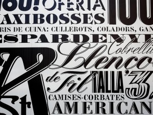 Many web professionals cite typography as a design favourite. Typically seen in print design, the Web has recently embraced and adapted these strategies, such as mixing and matching fonts that shouldn’t go together but somehow do. Best used in moderation, blocks of text should be kept to a font that’s easily readable. Another typography trend that’s made a shift to the Web is fullscreen text. Similar to large photo backgrounds, these designs involve the text filling all of the page. It’s a unique, engaging way to attract attention.
Web design, like the technology it serves, grows more sophisticated each year. In 2013, responsiveness, photo backgrounds, creative scrolling, fixed headers, minimalism and typography twists emerged as design techniques and trends that better enable businesses to stand out on the Web. Stay tuned for Part 2, which will discuss six more of the year’s most fascinating web design evolutions and trends.
Image Credits: Abduzeedo & Beacon Technologies & Eric D. Fields
There’s no denying that 2013 has been a pretty big year for web design. Many new concepts have emerged and been championed for their innovation and creativity. As the new year inches closer (how is it already October?), it seems appropriate to take a look at the trends we’ve seen over the past 10 months. Whether you’re a professional designer or a business owner, staying up-to-date is a fascinating and inspiring part of the job.
Responsive

Responsive web design first came on the scene in 2012 and shows no signs of disappearing. It emerged as a result of the growing number of people using smart phones, tablets and other devices outside of traditional desktop and laptop computers to access the internet. Responsive design allows a single website to respond to and display properly across a variety of screen sizes.
Infinite and Parallax Scrolling
Yesterday’s basic scrolling has been replaced by more dynamic options in 2013. Infinite scrolling, initially popularized by Pinterest, involves the website automatically loading more content when the user reaches the bottom of the page. This improves the user’s experience significantly, as there is no need to reload the page. Parallax scrolling involves separate, parallel website elements scrolling at different speeds. This adds depth to websites, increasing interactivity and user engagement.
Fixed Headers
Fixed headers are just that – they stay put while users scroll down the page. Having a fixed header that displays your main menu allows visitors to navigate websites quickly and easily, without having to scroll back to the top to check out a different area. Done right, this technique is clever, visually appealing and functional.
Minimalism

Clutter is distracting, and can even cause users to leave your site. This year we’ve seen a distinct focus on minimalism in web design – foregoing flashy images and unnecessary content in favour of what’s really important. A great example of this is Metro, the Microsoft-developed theme for Windows 8. Many of today’s designers are putting their own spin on this concept, which spotlights important content and features a grid layout.
Photo/Video Backgrounds
A design trend that caters to everyone’s inner photographer, large photo backgrounds command attention and, for businesses and individuals in creative fields, can demonstrate talent and expertise. A related concept that’s currently on the rise takes the concept of an oversized background image to another level – full video backgrounds. Bold, dynamic and confident, this trend capitalizes on the growing popularity of video marketing.
Fullscreen and Mixed Typography
 Many web professionals cite typography as a design favourite. Typically seen in print design, the Web has recently embraced and adapted these strategies, such as mixing and matching fonts that shouldn’t go together but somehow do. Best used in moderation, blocks of text should be kept to a font that’s easily readable. Another typography trend that’s made a shift to the Web is fullscreen text. Similar to large photo backgrounds, these designs involve the text filling all of the page. It’s a unique, engaging way to attract attention.
Web design, like the technology it serves, grows more sophisticated each year. In 2013, responsiveness, photo backgrounds, creative scrolling, fixed headers, minimalism and typography twists emerged as design techniques and trends that better enable businesses to stand out on the Web. Stay tuned for Part 2, which will discuss six more of the year’s most fascinating web design evolutions and trends.
Image Credits: Abduzeedo & Beacon Technologies & Eric D. Fields
 Many web professionals cite typography as a design favourite. Typically seen in print design, the Web has recently embraced and adapted these strategies, such as mixing and matching fonts that shouldn’t go together but somehow do. Best used in moderation, blocks of text should be kept to a font that’s easily readable. Another typography trend that’s made a shift to the Web is fullscreen text. Similar to large photo backgrounds, these designs involve the text filling all of the page. It’s a unique, engaging way to attract attention.

